For this unit we were looking at the ten formal elements. I found this unit consisted of a lot of hard work but I enjoyed it and found it interesting. I also feel confident that overall I have done this unit well. The ten formal elements we looked at were line, shape, colour, tone, depth, pattern, reflection, form, movement and form.
Our first tasks included creating a mind map for the formal elements, listing them and creating definitions for each. I think all of these tasks turned out well and were done to the best of my ability. To improve I would try and add to the mind map just so that it goes into as much depth and detail as possible. We also had to complete the discussion which also further defined each formal element and made it even clearer what was to be photographed.
The first formal element we had to look at was the lines. I think this was the easiest of the formal elements to shoot as literally everything is made up of lines so we wound never be short of things to photograph. However if I were to do this shoot again I would make sure that the straight lines I am photographing are as strait as possible and also try and photograph more attractive things that still show lines as the main focus. I think that it is clear from the quality of my line photos that this was the first shoot I did and I like to think that they have improved since then. I completed a image bank and definition for line and I think this went well as it is clear from these what I was hoping to photograph. From my straight prints it is clear that the main point of these photos is to show the lines. Overall I think that this section went well although I feel that since then my work (especially shoots) have improved.
With the formal element of colour we once again went out on location and photographed whatever we could find that showed colour. I think that the shoot went quite well as colour appears to be the main focus of nearly all of the contact sheet. To improve this shoot I would try and make colour the only thing in the picture just to completely ensure that this is the reason the photo has been taken. My straight prints came out quite well as they each show one colour that is completely obvious in the photo. To improve this section as a whole I would try and photograph more original things so that the photos are different from everyone else's.
Another formal element we looked at was pattern. I think this shoot went well because the location had lots of unique and original patterns around it. I think that my contact sheet for pattern shows the most improvement as these and the straight prints show an obvious pattern but still maintaining an attractive photo. I also think that there was a good range between the man made patterns and natural patterns photographed. To improve this section I would once again try and make sure that the pattern is photographed with not to much or no border of surrounding area and make sure that the whole of the pattern is photographed.
I feel with the formal element depth I got some very effective photos although I found these quite hard photos to achieve. My contact sheet shows this as it is clear that some of the photos were taken several times to get the correct angle or haven't ended up showing depth at all. If I were to do this shoot again I would just try and spend more time getting the angle correct the first time to prevent having a contact sheet full of very similar photos over and over again. Overall I think that my straight prints objectively show depth in an effective way, as an attractive photo and further show my improvement in my shoots.
I think that the formal element texture ended up being a very effective shoot which I think is reflected in my strait prints. Not all of the photos came out as I would have hoped but the ones that did show detailed texture. I also think that the textures shown in my photos are quite unique and different from one and other so there isn't to much repetition of the same texture. To improve this shoot I would make sure that the lines creating some of the textures are as strait as possible. I would also cut out the background so that the focus is entirely on the texture shown. Once again I feel that the straight prints from this show further improvement from the beginning.
My reflection shoot once again got a bit repetitive with what could be photographed as most of the photos where of mine, Beth and Lauren's reflection just changing what its reflected in. Some of the photos on the contact sheet also seem quite unplanned and if I were to do this again I would spend more time thinking about what I want in the photograph rather than just taking the photo again and again in hope that eventually it will achieve the photo that I want. Overall, once edited and cropped I think that my straight prints came out quite effective and show clearly the formal element of reflection.
For the formal element form we did both a location shoot and a studio shoot. For my location shoot I think that the photos show form but are not very well framed photos. Because for this shoot you have to rely on the position of the sun to get the photo it was difficult to just get the shadow in the photo which is why the photos are not framed very well. To improve I would try and only photograph the shadow and photograph more complex and unique shadows to create more interesting photographs. I think my studio shoot for form went better than my location shoot as it was easier to create the shadow than to rely on the sun to make them. The photos of Lauren came out well and I think that form was shown obviously in the photos. I shot both with a dark and light background and it is clear that the darker background showed form more obviously. To improve I would just make sure that the photos with the dark background were not to dark so that Lauren's outline didn't disappear.
When I photographed the formal element tone I was unsure of what I actually had to photograph to show this which I think is reflected in my contact sheets. I think that I found this the most challenging of all of the formal elements because I didn't know what type of thing would show tone the best later when made black and white. Looking back at my work from tone to improve I would photograph things showing very contrasting tones in order to achieve photos that it is obvious that this is why they are taken.
I shot the formal element shape again as I felt that the first shot could have been improved on. From the first shoot I felt that the shapes could have been photographed with less border so only the obvious shape was shown. I do think that the things I shot in the first shoot were quite imaginative in how I found the shapes but I could have found a few more complex shapes as the majority were circles and squares. In the second shoot I feel I did better in just having the shape with no border so I think these were more effective for showing the formal element.
I found it very fun when I was photographing movement because it was something I had not done before. I think the photographs of cars worked very well as they have a lot of movement which is shown clearly in the photographs, however I feel that it was difficult to find things on location that had enough movement for the camera to pick up. Overall I think that the straight prints for movement came out well showing and emphasising the formal element movement.
For the unit we also had to create physical experiments. These are where you physically change a printed photo, for example by either burning, cutting or sticking things to it. I found this enjoyable because it was nice to be able to be creative and physically change the photos. My favourite of my physical experiments was my plant where cut out round the shape of it and then cut around the leaves and folded them out so that the plant appeared 3D and like its original form.
During the unit for part of the development work we looked at the photographer Robert Mapplethorpe. We watched a video on him and took notes and then completed a location and studio shoot influenced by his work. Some of Mapplethorpe's work was not my favourite but I really enjoyed taking influence from his work and doing shoots similar to his portrait shoots. I think the studio shoot using a model went better than the location shoot as it was easier to control what was happening in the photo with lighting, background and pose so it was easier to edit this to create photos similar to Mapplethorpes. To improve these I would make them even more similar to Mapplethorpes work.
Other development work for the unit included going for walks and taking photos, photographing contrast and studio shoots. I think that all of this went well and the contact sheets and straight prints were very effective. I enjoyed this part of the unit because there was more freedom in what we could photograph and the photographs came out more attractive than the formal element photos. I also felt that we could make the work more unique in this part because it wasn't as restricted.
Friday, 20 December 2013
Wednesday, 18 December 2013
Connecting essay five - Texture photo

This photograph shows a street and within the street the textures. The photo shows a brick wall which is in clear focus so appears to be the main focus as the rest of the photo is out of focus. The texture shown in the wall suggest that the scene shown in the photo is rather aged and weathered also shown by the dull grey sky. The photo would have quite a negative affect on the audience due to the dark tones and pathetic fallacy in the photo. There does appear to be some brightness down the path in the photo so this could suggest a sort of light at the end of the tunnel feel for the photo. The angle of the sun is in a position so that all of the texture and holes in the bricks can be seen clearly and emphasised.

This photo shows the texture and depth of the wall. The sun is shining in at the right angle so all of the shadows can be seen showing the form and the texture within the photo. The sun is shining from the top left corner which creates a very positive, happy photo for the audience. The further back the wall goes the less in focus the photo is emphasising the focus on to the front of the wall where the most texture can be seen. The growing moss on the brick show life with in the photo which creates a whole knew side and meaning to the photo for the audience.
These two photographs connect firstly because they both show the textures within in a brick wall. Both photos also use the angle of the sun in order for the audience to gain different meanings to the photo. Both photos are also taken showing not only texture but also the depth of the wall creating a more interesting photograph. Finally both photos use out of focus as the photo gets further back to emphasise what is the main focus point of the photo.
Connecting essay four - Robbert Mapplethorpe (Isabella Rosolini)

Isabella Rossellini portrait by Robert Mapplethorpe.
This photograph is like other Mapplethorpe photos in that the models suggested character is shown in the photo. She appears to be calm and quite relaxed in her facial expression yet her hand placement contrasts this as this is quite a stressed pose. She is wearing dark clothing on a dark background so her pale skin contrasts against this just showing the form of the model. This would make the audience see the model and her facial expression as the main focus of the photo which was most likely Mapplethorpe's intention with the photo. With the majority of the photo being in a very dark tone this then draws the eye directly to the models lips and facial features bringing back the attention to her facial expression. The model is also central also making her the central focus point of the photo.

This photo shows a fairly plain, calm facial expression but the placement of the hand and body suggests that this is not the emotion being experienced in the photo. The model is looking to the floor which gives the impression she is thinking about something adding another thing for the audience to think about with my photograph. She is off centre questioning her importance in the photo but the dark toned background reinforces her importance in the photograph. She is wearing a busy shirt which takes the attention away from her facial expression which was unintentional at the time but does show the models character to be quite artistic.
These two photos connect because they both show a model of which the emotion being shown is unclear and compromised by different aspects of the photos. Both photos use facial expression and body language in order to emphasise an emotion of which is still unclear. While one emotion taken from both photos is calm and relaxed shown in the facial expression of each model the other is stress and unease shown in the contrasting body language. Both photos use a female model and portray emotions stereotypically associated with the more weak female character. Finally both photos use a dark background emphasising the focus onto the model and there paler form against the dark.
Friday, 13 December 2013
Connecting Essay Three - Adrienne Adam


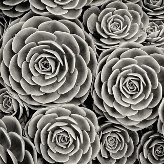
These two photographs connect because they both focus on the pattern created in the plants. They are also showing different shades of green in the plants. In both photos the centre of the plant and pattern is the centre of the photo with the outside of the photograph being the outside or widest part of the pattern. Finally both of the photographs show similar texture, similar objects photographed in the same way.
Connecting Essay Two - Flower Photographs

This photograph shows a flower in the centre of the photo, with the pink plant being contrasted on the green background. The shape and pattern of the flower is very clear and focused on in the photo. The flower is in focus and the background is blurred showing that the flower is the main reason for the photo being taken. The photo also shows the individuality and uniqueness of the flower as no others can be seen around it.

My photo shows the flower as the main focus of the picture due to it being central and being in focus compared to the background. The main reason for taking this photo was to show the pattern within the flower, with the red petals and the black and yellow centre. The photo also shows how the other flowers are blurred except the buds emphasisng the focus and importance of this flower.
These two photos connect firstly because are both of flowers which are the main focus point of the photograph. The background is blurred on both also emphasising that the focus is on the flower and no the background. Both photos also show pattern within the flower with the colour change in the outside and the centre of the flower and the petals shapes.
Connecting Essay One - Robert Mapplethorpe
 Robert Mapplethorpe 'Self portrait 1975'
Robert Mapplethorpe generally created photos where the model was not very obviously posed and the models personality could be seen through the photograph. This photo shows part of a person and is in black and white which is different to his normal photos. This photo is taken up by mostly background and the subject of the picture is not central and therefore is not the main focus of the picture. The photo would make the audience wonder why only part of the body is in the photograph and would make them question the main focus point of the photo. Because the photo is all quite a dull colour this emphasises the shadows and dark points in the photograph. The skin is darker than the background creating contrast and emphasising the shape of the body.
 This photo is showing the contrast between the background and the model. The pale hand and face contrasts against the dark colours of the brick wall making it stand out. Only part of the model is shown so the photo also shows contrasts with the thought of someone being there and not. This photo uses a dark background in order for the shape of the hand and shape of the body and face to be prominent. Because the background is busy rather than plain, the model is not central and the photo is mostly background this would make the audience wonder whether the model or the background is the main focus.
These two photographs connect firstly due to the unknown focus points within the photo due to the excess of background and the model that is not central. They both also only show part of a body as appose to a full body making a questioning point for the audience. They both show contrast between the background and the shape of the hand and the arm and both show the detail of them through this contrast.
Wednesday, 27 November 2013
Tuesday, 26 November 2013
Photographer five - Paul Strand


Chosen...
I have chosen this photographer because of his use of many of the formal elements such as line, form, tone and shape. I also really like the way that his photos showing form are of shadows cast from very detailed objects that create shadows with a lot of detail.
Influence...
This photographer will influence my work because I will try and take form photos with very intricate detail in them. I will also try and use tone in my photos in order to emphasis the main focus point of my photographs.
Summary...
Overall I like this photographer because his work very clearly shows the formal elements spoken about above. Also they all photograph quite complex objects which create complex interesting photos. What I dislike about his work is that colour doesn't play a very big role creating quite dull photographs that wouldn't catch your eye.
Friday, 8 November 2013
Photographer four - Giuseppe Bognanni


Chosen...
I have chosen this photographer because of the use of the use of formal elements and the attractive landscape photos that Giuseppe photographs. I especially like his photos when the sun creates an attractive effect on the photo.
Influence...
This photographer will influence my work because I will try and use the sun and natural objects in order to create photographs. I also will think about my position when I take photographs as I think position would have been important to Giuseppe when taking his photographs.
Summary...
Overall I really like this photographer because his photos are very attractive and almost appear as if they are fairytale, magical places. I especially like the last photo because of how the sun is shinning through the clouds creating a photo that could create many different meanings for different people.
Photographer three - Pete Turner

.png)


Chosen...
I have chosen this photographer because a lot of his work shows the formal elements and therefore should be good to use for my work. Also I think his photos are taken in a way that differs from other photography and his choice of things to photograph is different.
Influence...
This photographer will influence my work because I will use the idea of showing movement at night because this creates an effective and attractive photograph. I will also try and photograph objects that are not usually photographed to create more unique photos.
Summary...
Overall I like this photographers work because the photos are taken in a different way and the colours make the photos eye catching and attractive. What I don't like about this photographer is that the choice of objects to photograph are not always attractive such as the bin, I do however think that this makes the photographers work different to other photographers.
Photographer two - Adrienne Adam


Chosen...
I have chosen this photographer because of the clear interest in the formal element pattern going with the work I will be completing. I like the way the photographer has taken the photo so that the only thing in the photo is the pattern and they are all taken of naturally occurring patterns instead of manmade or arranged patterns.
Influence...
This photographer has influenced my work because when photographing pattern I will try and make sure I only photograph the pattern so it is obvious this is the reason the photo has been taken.
Summary...
Overall I like this photographer because they show pattern in a different way to other photographers that I have seen. The only thing I don't like about this photographers work is the colours are quite dull and bland which prevents the photo being very eye catching.
Photographer one - Daniel Kukla
.png)
 This photo slightly differs from Kulka's as this one is taken at night. It still uses the idea of reflecting the sky but in the mirror this time the sky is dark and the stars can be seen creating a very beautiful photo.

Chosen...
I have chosen this photographer because of his very unique way of capturing scenes in his photos. He uses the formal element of reflection in order to create these effective photographs. I also really enjoyed looking at these photos as they really give you the feel of being in a place like the dessert.
Influence...
Summary...
Overall I like this photographers work because he uses a very unique way of showing the landscape. I think it shows how not all of the area is the same all the way round and they are very interesting photographs because you can see the whole surrounding area.
Thursday, 7 November 2013


Wednesday, 30 October 2013
Discussion
 The formal elements are Line, shape, form, movement, tone, Colour, Pattern, Depth, texture and reflection. The formal elements are the basics in what is needed to create a photograph and these can be arranged in ways in order to create different and better photographs. The formal elements can be used to show things that are not shown to the human eye for example movement is shown in photography by blurring which you wouldn't see normally.
I will create image banks and work diaries in order to track my progress in photography and see improvements over time.
 Lines are shown in most photography as most things are made up of strait, curved and wavy etc. but some photographers choose to take pictures emphasising the lines in the photo. Railway tracks and buildings have quite obvious lines within them creating quite intricate and detailed photos.
Shapes are shown in many different things such windows, signs, shadows, drains etc.
Form is found in shadows which show the three dimensional shape of an object.
Movement is shown in the blurring in a picture. Cars and amusement park rides often show blurring and movement when photographed due to there lights and movement.
Tone is the dark and light shades in a photo often in black and white photos. Tone is often shown in photos of plants, and things with contrasting colours.
 Colour is found everywhere but photos showing colour are commonly of flowers, plants and brightly coloured objects making colour a main focus point of a picture.
Pattern is often found in birds feathers, animal patterns and landscape's.
Depth is found in the height of buildings, lengths of roads and rows of objects.
Light is a key when photographing texture, when the light shines on a textured object in a certain way all of the varied textures show up. Tree bark, bricks and paths often show different textures.
Reflections are shown in windows, mirrors and most things that are made of glass.
Formal elements help to break down everyday life in order to create effective photographs.
Friday, 25 October 2013
Thursday, 24 October 2013
Words to describe the world...
|
|
|
|
|
|
|
|
|
|
|
|
|
|
|
|
|
|
|
|
|
|
|
|
|
|
|
|
|
|
|
|
|
|
|
|
|
|
|
|

Monday, 21 October 2013
Image bank: Form


Definition: Form
Dictionary definition
The visible shape of configuration of something.
a particular way in which a thing exists or appears.
Describing words
- Shape
- 3D
- Shadows


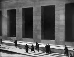
The light casting the shadows through the windows of the building show that it has a physical form and structure a there is a shadow because the light cannot shine through the form of the building.
My definition
Form is the shape and appearance of an object which creates a shadow.
Subscribe to:
Posts (Atom)